
Introducing the latest instalment in our Data Deep Dive series, To Code or Not to Code - Dashboards, written by NICD Data Scientists Louise Braithwaite MSc, Stephen Dowsland MSc, Dr Paul Goodman, Dr Fergus McClean and Dr Peter Michalák
Introduction
One common way of extracting value from data is visualisation. This visualisation can take many forms. Static images of plots in PDF reports are one common option, but what if you want to be able to interact with these reports? What if you want them to automatically update based on new data? This is where dashboards come in. There is no universal definition of what is and what isn't a dashboard, but one way of defining them is:
Combinations of data visualisations which are interactive and automatically updating
This interactivity and automatic update capability supercharges your visualisations and provides greater opportunities for extracting value and actionable insight.
So, you have decided you want a dashboard. What do you do next? Well, there are a number of options available to you. Some of them involve writing code, some involve writing a small amount of simplified code, and some involve writing no code whatsoever. These options are generally referred to as no-code, low-code or code-based solutions. There are various advantages and disadvantages associated with each, related to flexibility, cost, development, and deployment. We will explore these in detail throughout this article, providing examples using common tools where possible. The table below gives an overview of the key differences. This table is obviously over-simplified and does not account for differences between tools within each category, or the specific use case that you have in mind. It is provided only as a quick summary of the key takeaway messages.
| Area | No-code | Code |
| Development | Fast | Slow |
| Skill level required | Low | High |
| Flexibility | Low | High |
| Pricing | High | Low |
| Deployment | Simple | Complex |
We will first summarise some options for no-code and code-based tools before exploring each area identified in the table in more detail. Finally, we will provide some examples of use cases in which you might choose to opt for a code or no-code solution.
Code-based dashboard frameworks
Plotly Dash
Plotly Dash is an open-source Python framework for building web-based data visualisation dashboards. The framework is built on top of Plotly.js -- a high-level declarative charting library, and React.js -- a JavaScript library for building user interfaces. Dash allows users to create interactive, web-based dashboards using only Python code. This makes it a powerful tool for data scientists and engineers who want to quickly prototype and deploy data visualisations without needing to write JavaScript. Dash also has a built-in support for a wide range of chart types, such as bar charts, scatter plots, and map visualisations, making it easy to create complex visualisations. Additionally, it allows users to easily add interactivity to their dashboards, including dropdown menus and sliders, to allow users to explore the data in more depth.

All the code you need for loading the dataset and creating a Plotly Dash dashboard is below:
import dash
from dash import dcc, html
import pandas as pd
import plotly.express as px
app = dash.Dash()
# Load temparature data
df = pd.read_csv("https://nicdpublic.blob.core.windows.net/blogdata/temp.csv")
# plotly dash layout of the app
app.layout = html.Div([
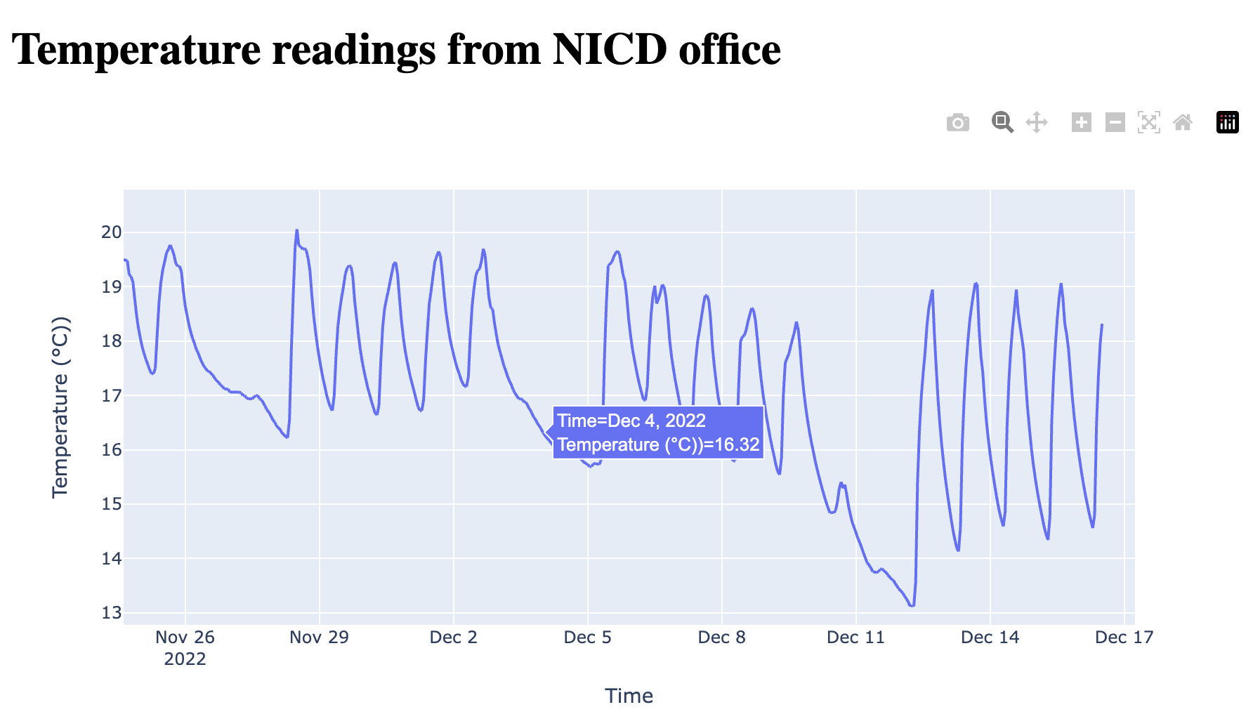
html.H1(f"Temperature readings from NICD office"),
dcc.Graph(
id="nicdtemp",
figure= px.line(df, x="datetime", y="temp",
labels = {'datetime':'Time', 'temp':'Temperature (°C)'}),
)
])
if __name__ == "__main__":
app.run_server(debug=True)
The following packages are required for the implementation to run:
dash
dash-core-components
dash-html-components
pandas
plotly
For full reproducibility you can access the temperature data for this blog post from this link.
Streamlit
Like Plotly Dash, Streamlit is an open-source Python library for building web-based data visualisation dashboards. Streamlit's advantages are the ability for rapid prototyping, fast visualisations, and ease of use.

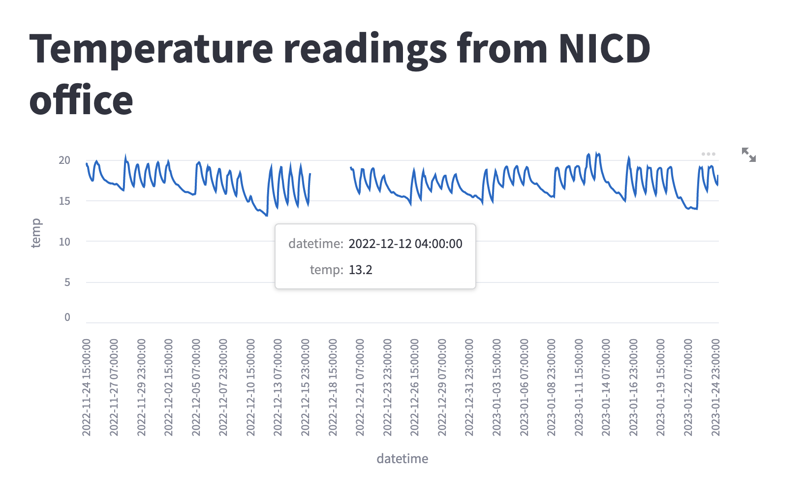
Five lines of code are all you need to have a simple dashboard displaying the temperature in our office in The Catalyst building.
import streamlit as st
import pandas as pd

# Load sample time series data
df = pd.read_csv("https://nicdpublic.blob.core.windows.net/blogdata/temp.csv")

# Create the Streamlit app
st.title("Temperature readings from NICD office")
st.line_chart(df, x="datetime", y="temp")
The code imports the Streamlit and Pandas libraries. It then loads a sample time series data from a CSV file and stores it in a Pandas DataFrame called "df".
The Streamlit app is created with a title "Temperature readings from NICD office" using the st.title() function. Finally, a line chart is displayed using the st.line_chart() function, with the data from the "df" DataFrame and the "datetime" and "temp" columns specified as the x and y-axis, respectively.
These are the packages needed if you'd like to reproduce the Streamlit implementation:
streamlit
pandas
As of writing of this blog post (March 2023), Plotly Dash had 18k stars on its Github repository, and Streamlit had 22.3k stars (Github). Both tools therefore have a healthy user base and a growing community of users.
R Shiny
The 'R' Programming language has found substantial use in the world of academia, finance and research. On its own 'R' is generally used as a language for mathematical or statistical computing, but its functionality can be extended through the use of 'packages'. One such package is 'Shiny', which enables the development of interactive web applications directly using 'R'.
Getting started with coding in 'R' can be as simple as downloading the correct install for your machine, but typically, an Integrated Development Environment (IDE) such as the open-source 'RStudio' makes life easier, and coding sessions more productive.
Two further extensions of Shiny allow the creation of attractive dashboards:
-
flexdashboardwhich uses 'R Markdown' code, which is like HTML code, to group data visualisations into a dashboard, which can be styled and customised with CSS, and: -
shinydashboardwhich uses Shiny's own 'bootstrap grid' user interface to set the dashboard layout. A code example for 'shinydashboard' is given below.
The Shiny dashboarding page includes a comparison of the two approaches, outlining the advantages and disadvantages of each. The page also has a number of tutorials and resources for the first-time dashboarder!
Shinydashboard Example
The image below gives an example of a simple Shiny dashboard, to display the example temperature data.
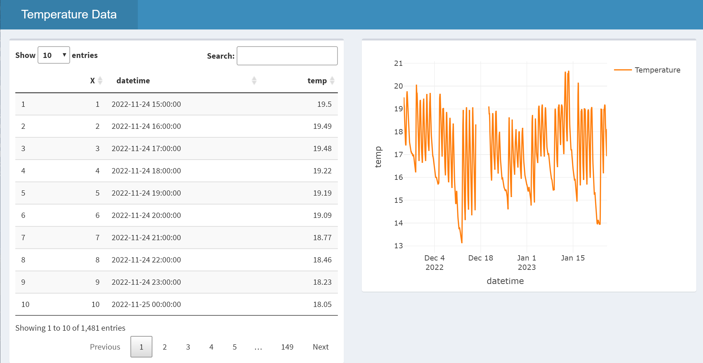
The code to produce the dashboard in the image is displayed below. Every 'Shiny' application has two elements: a user interface definition controlling how the web application will look, and server code that provides the 'behind-the-scenes' processing for the application.
# Add the required packages to R's environment
library(shiny)
library(shinydashboard)
library(plotly)
library(DT)

# Load the required data
temperature_data <- read.csv('https://nicdpublic.blob.core.windows.net/blogdata/temp.csv')

# User Interface definition
ui <- dashboardPage(
  dashboardHeader(title = "Temperature Data"),
  dashboardSidebar(disable = TRUE),
  dashboardBody(
    fluidRow (
      box(dataTableOutput("data_table")),
      box(plotlyOutput("temp_plot"))
    )
  )
)

# Server code - processes inputs and outputs objects
server <- function(input, output) {

  #Render data table using 'DT'
  output$data_table <- renderDataTable({temperature_data})

  #Render time-series graph using 'plotly'
  output$temp_plot <- renderPlotly({
    plot_ly(temperature_data, type = 'scatter', mode = 'lines') |>
      add_trace(x = ~datetime, y = ~temp, name = 'Temperature')
  })
}

# Create and return a Shiny app object
shinyApp(ui = ui, server = server)
What can't be seen from the image, however, is that the dashboard itself is dynamic, with its layout changing, and contents resizing to fit within the browser window.
The code starts with loading the required libraries (packages) into the 'R' environment, followed by loading the required data from file.
Next, within the User Interface Definition section, three display elements within a dashboard page are created. These are:
- A dashboard header and title.
- The main body holding the dashboard content. This main body holds a single
'fluidrow', which itself holds two boxes that will contain the user interface elements. The user interface elements within the boxes are individually named 'outputs' of specific types - a 'data table' and a 'plotly' graph. - An optional sidebar element that has been disabled in this instance.
The server code uses the output type and name definitions to display the correct data content within the final dashboard.
The very last line of code combines the defined UI and server code to make a Shiny application.
Deploying Shiny dashboards
Having created our dashboard, we need to deploy it so that others may use it. For Shiny-based dashboards there are a few deployment options available, including both free and paid options. Three three main options are:
- Shinyapps.io - free or paid deployment in the cloud
- Shiny Server - for local deployment (e.g. within an institution, behind a firewall)
- RStudio Connect - a professional offering targeting team-based development, incorporating multiple technologies (e.g. R and Python)
The Shiny website has further discussion of these three options.
No-code dashboard tools
Power BI

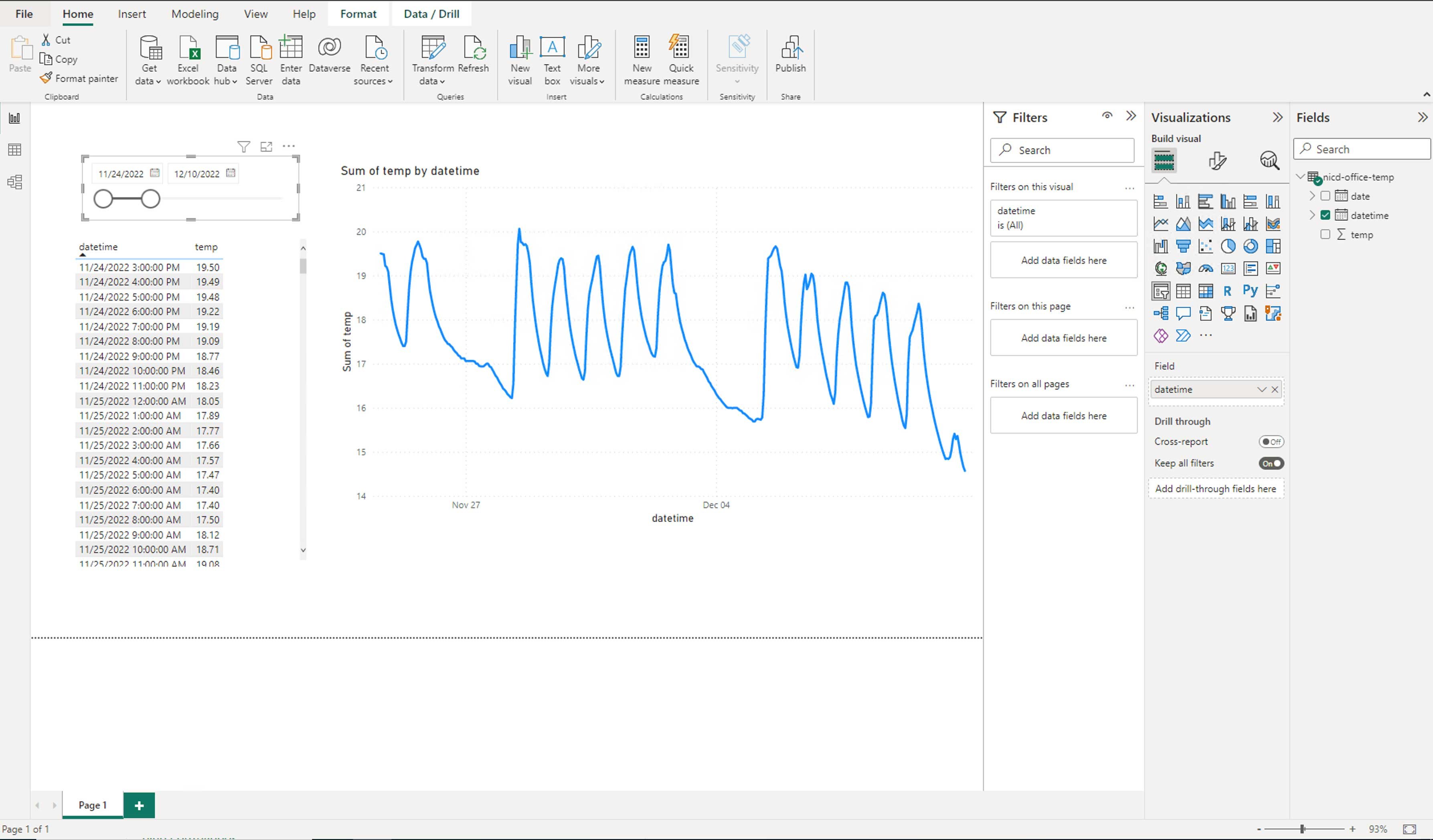
Power BI is an enterprise business intelligence tool that enables organisations to connect to data sources, and to manipulate and visualise data through the development of apps, reports and dashboards. Power BI has a number of parts, each designed for the different data users within an organisation.
- Power BI desktop is a Windows desktop application designed for report and dashboard creators.
- Power BI service is an online software as a service (SaaS) solution for sharing reports and dashboards across a team or organisation.
- The Power BI mobile app for Windows, iOS, and Android devices was designed for business users who need to be able to monitor data on the go.
Power BI allows you to connect to many data sources but there is no support for .ods files. Power BI provides users with the access to several in-built visualisation types and a marketplace of tested and approved custom visuals developed by Microsoft and community members. Visuals are easily created by dragging variables to the visualisation pane and then adjusting the settings. Users can also adjust how dashboard visualisations interact and enable drill-down options. Mobile-responsive dashboards can be developed for the Power BI mobile app but users are currently unable to develop dashboards with responsive web designs. Power BI desktop and Power BI service can be accessed for free but Pro and Premium licenses enable more functionality and report and dashboard sharing options.
Looker Studio (Formerly Google Data Studio)
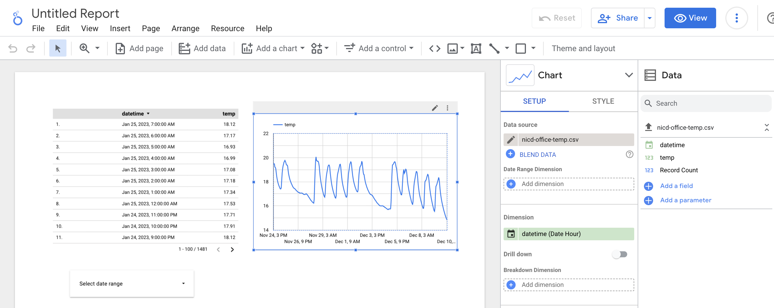

Looker Studio is an online tool for building dashboards, hosted by Google Cloud. In contrast to PowerBI, there is no desktop version of the software, and everything is done in the browser. There is an enterprise version of the software (called Looker) but pricing is only available on request. There is support for connecting to over 700 types of data sources. Microsoft Excel is not included in this list, though if you are choosing Looker, you are probably within the Google ecosystem and using Google Sheets anyway. 40 types of visualisation are available, including good support for mapping. Looking at the gallery of examples, the look and feel of Looker dashboards seem to be more customisable than PowerBI. However, the layouts are just as unreactive to screen size. Like PowerBI, they offer a mobile application for viewing dashboards on mobile devices.
Tableau
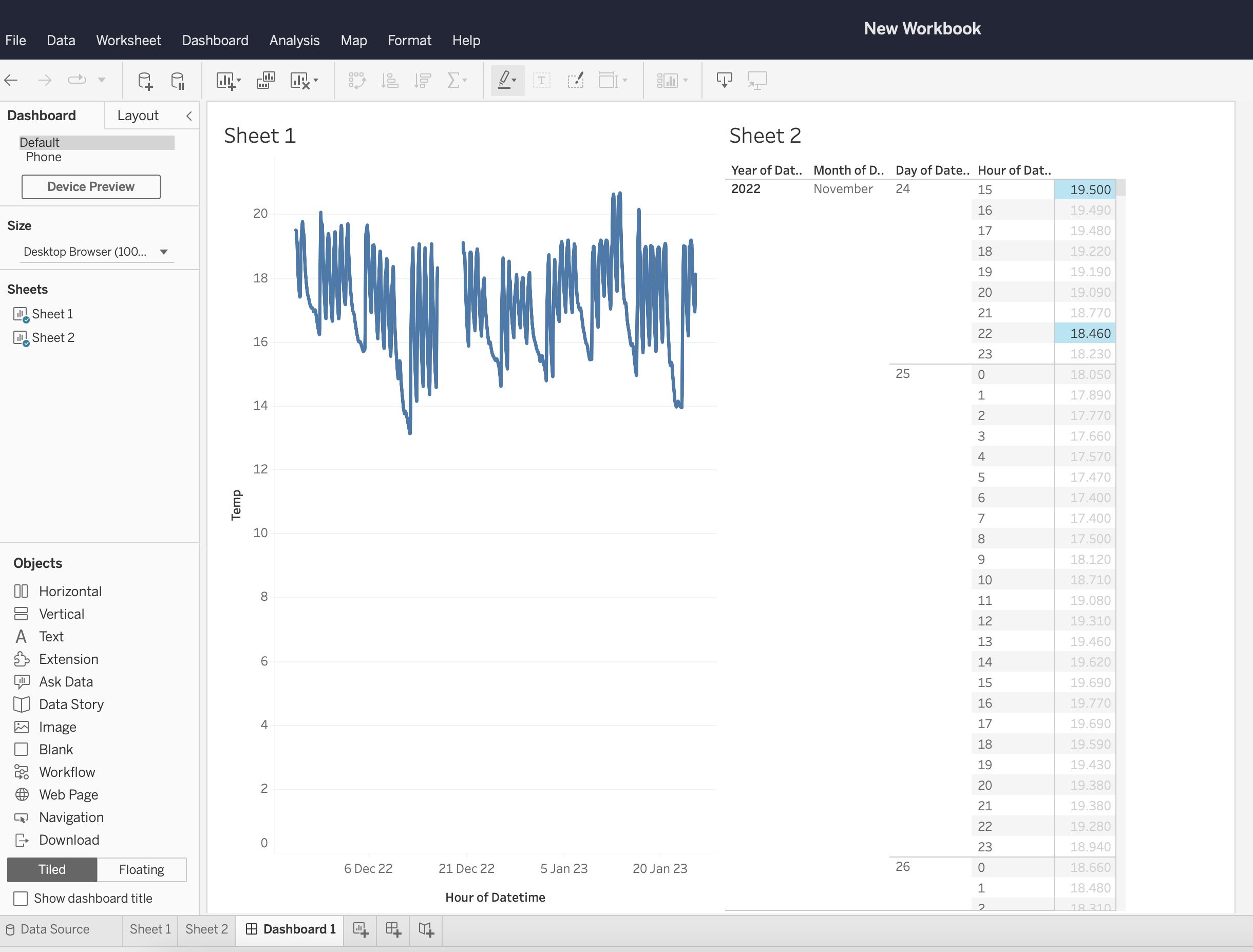

Tableau is a visual analytics platform that can be used in the cloud or on your desktop. Like Power BI, Tableau offers different products for different data users. The licensing structure reflects this with different prices for Tableau 'creators', 'explorers' and 'viewers'. Tableau can connect to different data types, stored in many locations. Tableau takes a different approach to creating data visualisations. Tableau automatically builds visualisations when the user drags variables into the column and row fields. This approach removes the need for the user to select a visualisation type. Tableau makes use of tiled containers to enable responsive design.
Development (skills required)
People with the skills required to build a code-based dashboard are undoubtedly more difficult to find than people with the ability to create a no-code dashboard. However, a good understanding of the data and dashboard requirements is needed in both cases. If your data is complex or requires many pre-processing steps before it can be visualised, then you may need someone who is comfortable writing code anyway. Coding skills may also be useful across across other parts of your organisation, so it would be a good idea to consider whether hiring a developer would have a wider positive impact. Of course, if you would like to allow anyone already within your organisation to modify your dashboard, then no-code is probably the way forward, unless all your staff are comfortable writing code. The other option is to upskill those already working within your organisation. This would enable them to develop not only code-based dashboard solutions but also give them the ability to use these skills to increase productivity when doing data analysis or data science in general.
A key difference between code and no-code is the way in which dashboards are developed. When using no-code, charts and other visualisations are usually created by clicking buttons and then dragging a frame around a canvas. The advantage of this is that it is very quick and easy to try out multiple different types of chart and see what it might look like in different positions on the page. However, reusing layouts across different pages or dashboards is less easy than if using code. The configuration of the chart is also done by clicking buttons or entering values in boxes rather than writing code. These buttons and boxes can at times be difficult to find, in comparison to searching the documentation of a code-based solution.
Working together with other people on the development of a no-code dashboard can present challenges, as some platforms do not allow multiple people to edit the same dashboard at once. This is not an issue when developing code using a version control system like Git, which is designed for developer collaboration. It is possible for more than one person to work on a no-code dashboard but not always at the same time. Therefore, you should consider the pace of development and number of developers involved in your project.
Flexibility
The next area to consider when choosing between code and no-code is how much control you want to have over the look and feel of your dashboard. Code-based dashboards inherently come with more control than their code-free counterparts. Tools such as Plotly Dash and R Shiny will allow you to include your own Cascading Style Sheets (CSS) which are an easy way to modify the theme and layout of your dashboard across multiple pages. This is not the case with platforms like PowerBI. Custom themes are available here, but they provide a fraction of the power and options that CSS gives you. The built-in styling options of no-code dashboard platforms will probably allow you to get quite close to your ideal design if your requirements are not highly specific. If you are willing to lay out each page manually, however, then no-code might be the best option. If your dashboard incorporates many different pages and you want to be able to update the layout easily across all of them, then using code will usually be the best way of doing this.
The increased flexibility of code over no-code also extends to data import and pre-processing. Many more data sources are available to dashboards using R and Python due to the vast array of open-source libraries available for these languages. This means that datasets that are not accessible to no-code platforms may require a code-based solution. If your data is in a very complex or deeply layered format and needs to be transformed in a non-standard way then it may also be easier to do this using Python or R than using something like M (the language that PowerBI uses). Some operations may not actually be possible when using no-code solutions. This is not a problem in most cases, however. The capabilities of no-code solutions for importing and transforming data are impressive and can handle most situations.
Pricing
No-code platforms usually come with a recurring cost which includes a license to use the software. Code-based libraries, on the other hand, are usually free to run but will incur a cost to host unless you're using a free hosting service. You may or may not wish to factor the development time required for your dashboard into the cost of the final product. If you do so, then the added cost of no-code may be offset by the reduced time and skills required for development. The calculation may also be impacted by your number of users and developers. For example, PowerBI charges for a Pro license for all users of dashboards created by developers with Pro licenses. Alternatively, you can pay more for a Premium capacity which will allow users without a Pro license to view the dashboard.
Deployment
When using a no-code solution, many of the challenges of deployment are removed. We have discussed above that this does come with the trade-off of increased cost. It also comes with less flexibility when it comes to authentication methods. For example, you cannot log into a Looker Studio dashboard with a Microsoft account. However, if you are looking to simplify and outsource the authentication process, no-code is certainly a good option. If you would like a custom domain name, though, this may not be available as part of a no-code solution.
Code-based solutions are more likely to break in deployment. This is most likely to be caused by changes in source data. This problem can be mitigated by automated testing, however, tests take extra developer time to write. A more robust solution is to create a data warehouse that stores data in a suitable structure for the dashboard and update this on a schedule. This way, failures will happen at the update stage and not at the dashboard. Again, more developer time is required. No-code solutions will tend to fail more gracefully by default when data changes unexpectedly or is inaccessible. However, they may introduce errors that go unnoticed if the data changes in an unexpected way but does not break any visualisations. An example of this could be values going outside of an expected range. It is easier to write tests for situations like this when using code, although you do still need to anticipate what might go wrong before it actually goes wrong.
Community/Support
Code-based solutions are generally well supported by large open-source communities. R and Python both have a large ecosystem of packages created by both individuals and organisations. Where packages are created and released by organisations they generally come with some level of basic support from the company in terms of bug fixes and security, with more comprehensive support available as a paid service. Packages created by small companies or individuals may not have any support or ongoing development, so may not be suitable for use in a production system.
No-code solutions generally follow the "freemium" model, with users able to get started for free, with basic support from the vendor, but with most support coming from any community that may have been developed organically or intentionally by the vendor. Moving to paid options usually unlocks more comprehensive support from the vendor and access to internal or closed community support.
Example use cases
Code example
Your organisation has a team of developers with experience deploying and maintaining web applications. You want your dashboard to be very in tune with your brand and to have fine-grained control over layouts and appearance. Your data may be complex and require multiple non-trivial pre-processing steps. Some data sources may also have uncommon formats and be difficult to parse. You want to make your dashboard available to users outside your organisation and let them access it easily using a mobile device.
No-code example
Your organisation has limited people resources to devote to developing a dashboard and the team lacks experience of writing code. You have the budget to support licenses for the number of developers and users of your dashboard. Your data sources are supported by the no-code platform of your choice and require minimal preprocessing. You want some control over the appearance of your dashboard but there are no detailed requirements. The users of your dashboard will typically access it using a laptop or desktop computer and not a mobile device.
Recommendations
There is a lot to consider when choosing a solution to go with for creating your dashboard. Creating a requirements document may help you to unpick which route to take. One approach might be to start with no-code and see how far you get. This will let you understand the capabilities and limitations of no-code for your use case. However, be wary of the sunk cost fallacy. You may invest so much time developing a no-code dashboard that you will be resistant to switching even if you are pushing the limits of what no-code can do and it would be a better idea to transition to using code.
People are key to your decision, so consider what people you have available to develop your dashboard, or what people you would like to have.
Summary
We have identified 4 key axes which differentiate code and no-code solutions for building dashboards:
- Development (including skill level)
- Flexibility
- Pricing
- Deployment
Each platform or framework will sit somewhere along each of these four axes. We have summarised a few of the solutions available, but there are many more out there to discover. We provide examples of typical cases when code would be best and when no-code would be best. Finally, some recommendations are given to help you make your decision. Hopefully, this article has helped you to consider the range of options available to you and how your situation aligns with these. Happy dashboarding!